8B Development
Brand Identity & Social Presence Logo Presentation · ae creates, 2026
Introduction
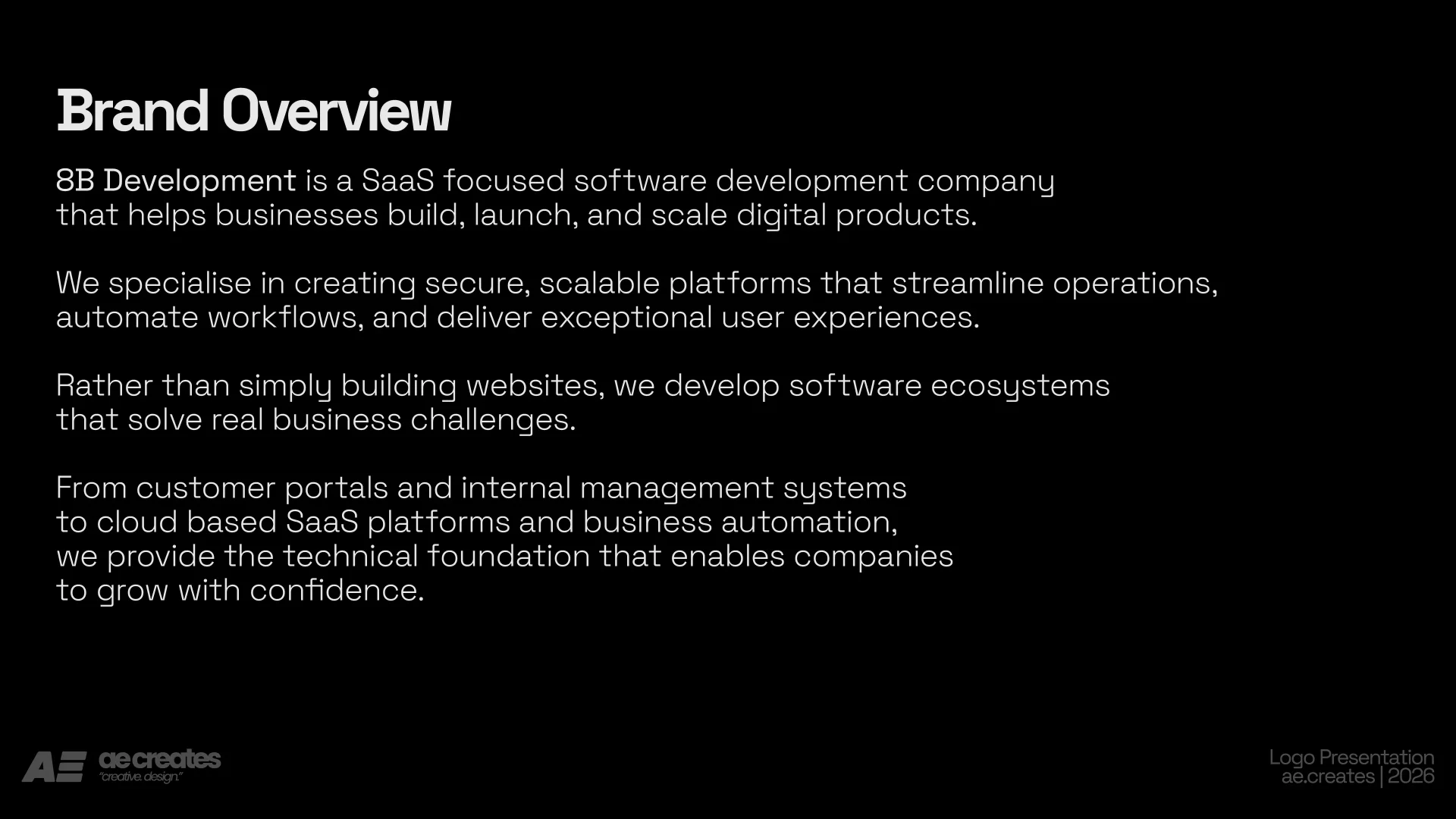
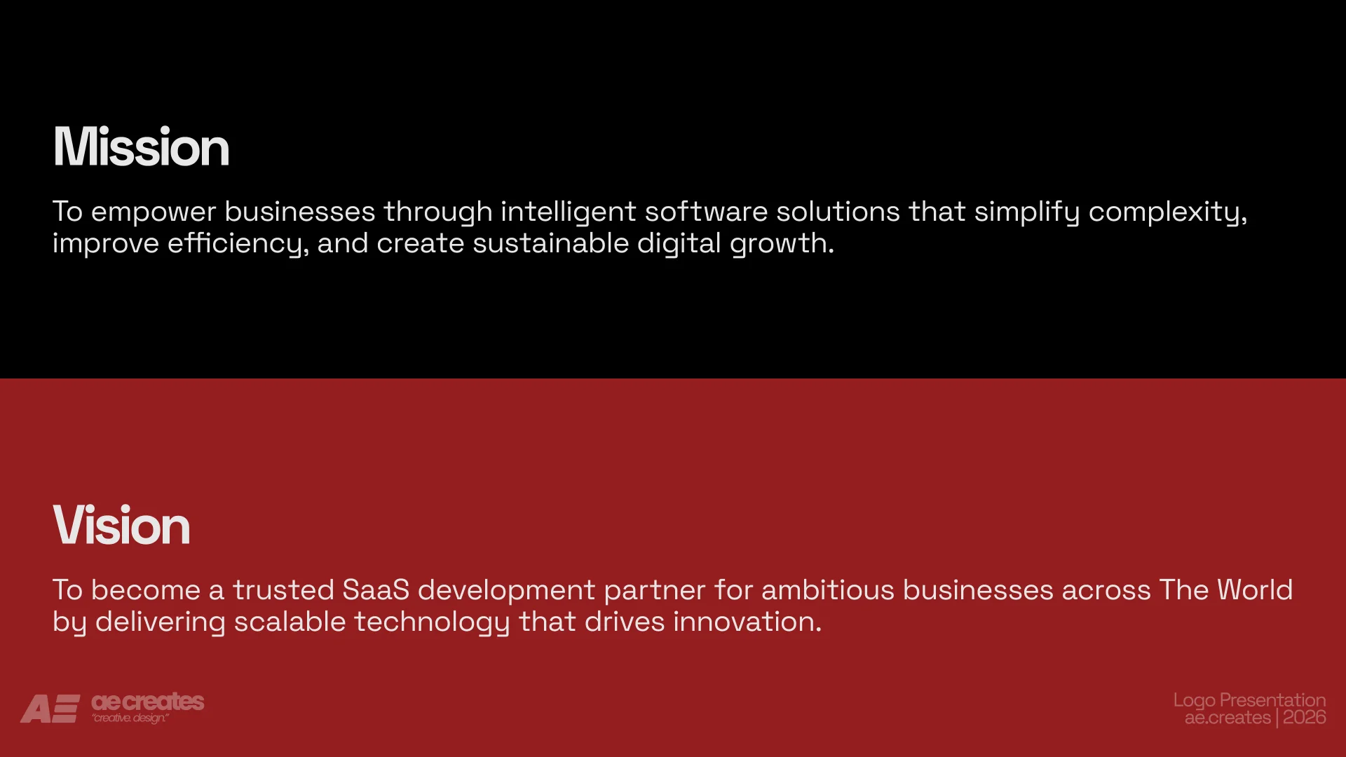
8B Development came to us needing an identity that could carry real weight in a crowded tech market. As a software company building backend infrastructure, they needed a brand that felt as solid and dependable as the systems they build. Not another generic tech logo, but a mark with a real idea behind it.
The Brief
The goal was simple to say and hard to deliver. Create an identity that says secure, scalable and reliable without saying it in words. It needed to work as a small app icon and as a bold statement on a landing page. It needed to hold up in black and white, on a phone screen, and across a full social media presence.
The Concept
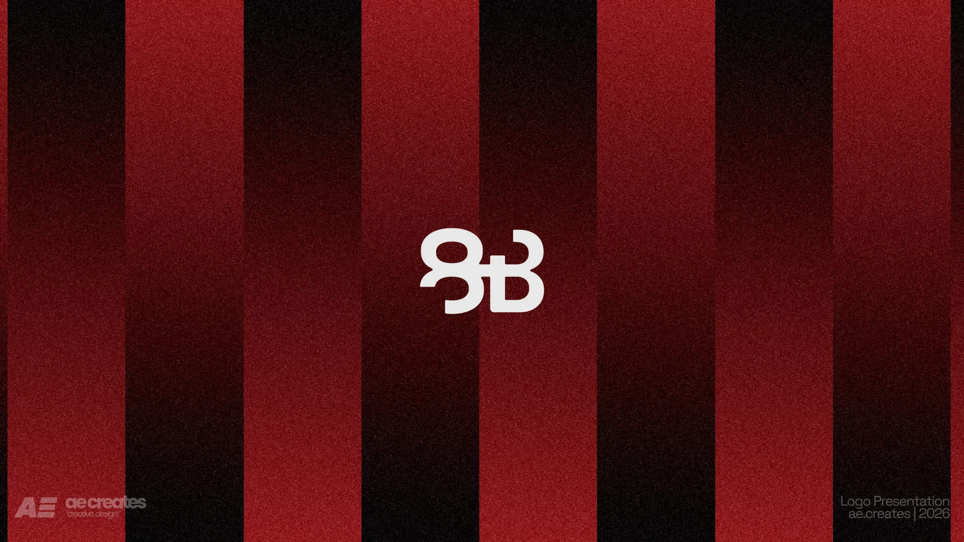
The mark is built from two mirrored forms, locked together and looping into each other with no clear start or end. It reads as an 8 and a B at once, but the real idea is the loop itself. A closed circuit. A system that keeps running without failure.
That single idea became the foundation for everything else. Simple Secure Systems That Just Work is not just a tagline. It's what the symbol is built to say before anyone reads a word.
Visual Identity
The palette leans into deep red and black, a combination that feels confident and slightly technical rather than soft or corporate. White is used sparingly, kept for contrast and for moments that need to breathe.
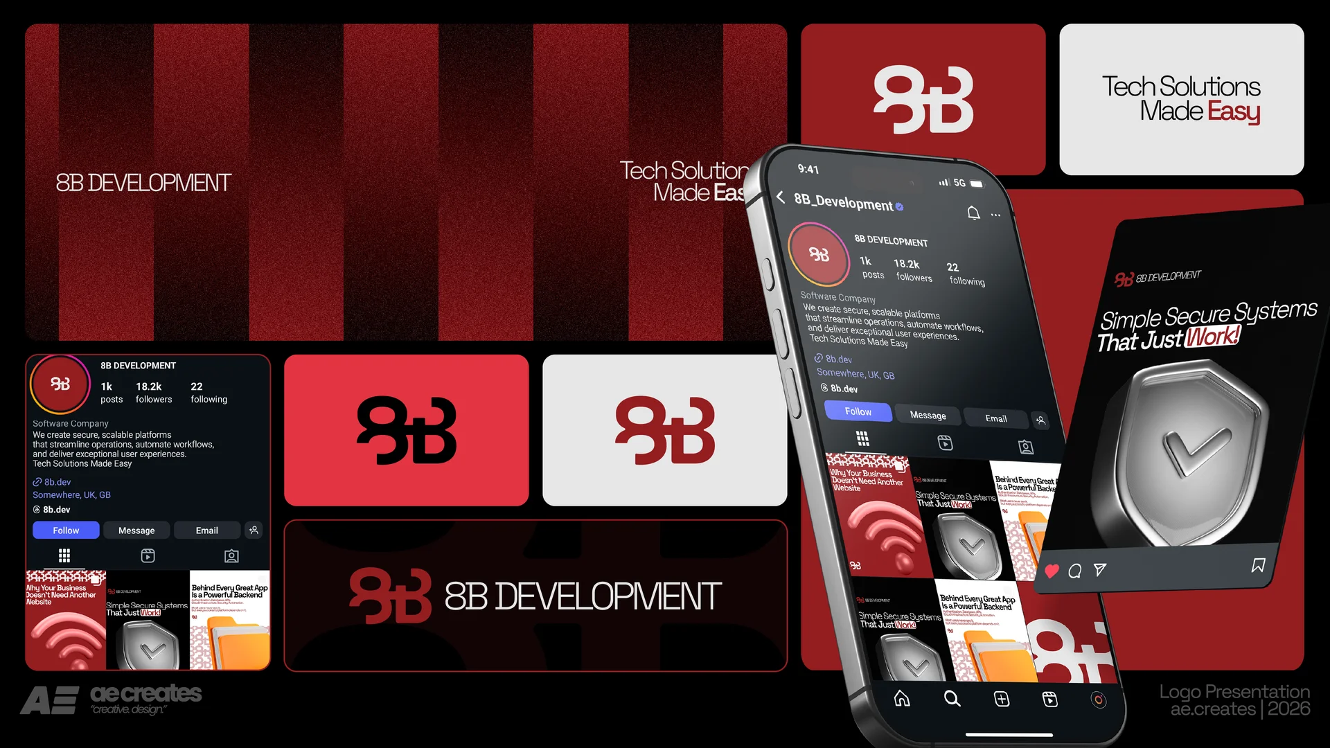
Supporting icons, a shield, a signal, a folder, tie back to what 8B actually builds. Security, connectivity, and data, made visible in a way that fits the mark without competing with it.
Bringing It to Life
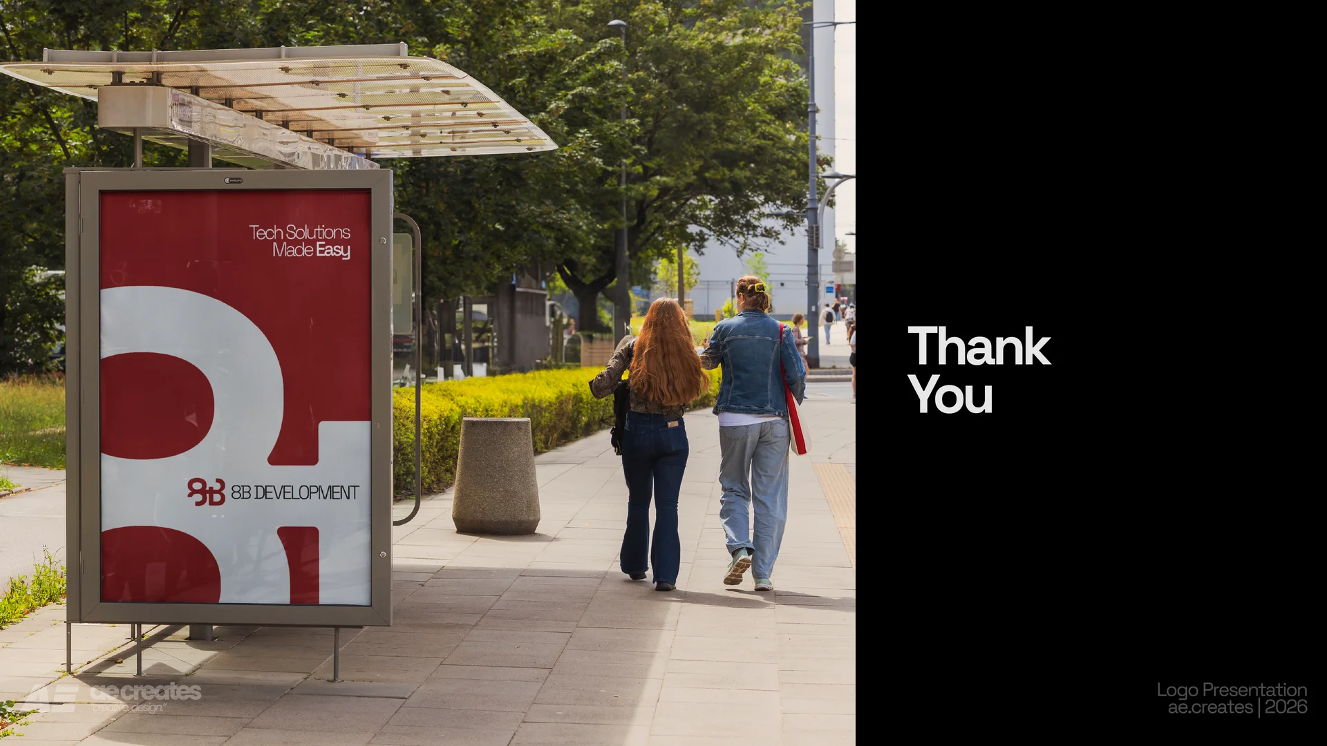
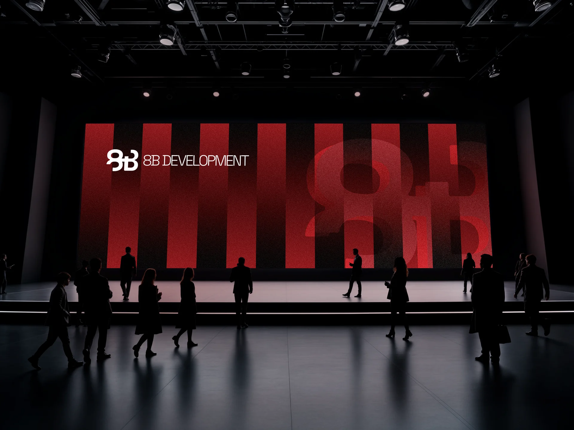
The identity was applied across a full Instagram presence, profile, grid, and story templates, along with app icon variations and presentation mockups. Every touchpoint carries the same idea. Solid, connected, and built to last, whether it's showing up as a tiny icon on a phone or a full screen graphic.
Conclusion
8B Development now has an identity that does more than look good. It tells you what the company stands for before you read a single word. Simple. Secure. Built to run without stopping.